Transit Flow app.
My role: UX Design, Prototyping, UI Design, User Research, Information Architecture
Tools used: Figma, InVision, Moqups, Marvel App, OptimalWorkshop.com
Outcome: Shifted a transit payment tool into a proactive commuting assistant that reduces missed rides, lowers stress, and supports real-time decision-making.
Overview
TransitFlow is a smart commute assistant for busy city commuters. Unlike traditional transit apps that focus on routes and schedules, TransitFlow answers a single critical question:
“When should I leave to make my commute on time?”
By combining predictive timing, progressive disclosure, real-time adaptation, and cross-device design, the app guides users through high-pressure routines with minimal cognitive load.

the challenge
Commuters rely on transit systems to get to work and home on time, yet many experience friction during their daily routine. Payment systems like Presto simplify fares, but several pain points remain:
• Transit card balances running out unexpectedly
• Delayed payment updates
• Missing buses or trains due to timing misjudgments
• Stressful morning routines where small delays compound quickly
For many commuters, especially during busy mornings, even a few minutes of lost time can mean missing a train or waiting another 15 minutes for the next one.
Commuters sometimes fail, not because they lack route information, but because chaotic routines and unreliable time perception undermine their ability to make timely decisions.
How might we design a system that helps commuters stay on time while simplifying transit payments and trip awareness?
Product Evolution
TransitFlow began as a payment and top-up tool. Early research revealed that timing—not payments—was the true pain point, prompting a shift:
From transit wallet → to proactive commute assistant
The Opportunity
Existing transit apps focus primarily on route planning and schedule lookup.
However, interviews revealed something different: commuters weren’t struggling to find routes, they were struggling to manage time and payments during hectic routines.
The opportunity was to design a product that acts as a commute assistant, not just a transit utility.
The Solution
TransitFlow reduces commuting friction through three integrated systems:
1. Smart Transit Wallet
Real-time balance visibility
Automatic top-up when below a threshold
Quick tap payments
Impact: Removes payment anxiety, allowing users to focus on timing.
2. Predictive “Leave Now” System (Core Feature)
Learns commute patterns (e.g., 7:30–9 AM)
Sends tiered alerts as departure approaches (light → haptic → alarm)
Displays consequences only when it affects decisions
Adjusts for delays: “Leave now — next train may impact connection” or “You can leave 8 minutes later due to delay”
Decision Design Principle: Prioritizes a single recommended action over multiple options to reduce hesitation.
3. Watch-First, Progressive Interface
Glanceable alerts and haptic feedback
Progressive disclosure: Surfaces only the next required action (leave → NFC/payment → board)
Post-boarding confirmation of fare deduction and balance
Impact: Supports real-world context with minimal cognitive load.
User Research
To better understand commuter behavior, I conducted interviews with 10 transit users aged 28–45 in Toronto who regularly commute using the TTC and GO Transit.
The goal was to understand their routines, frustrations, and how they interact with transit technology.
Key Questions
• How often do you take public transit?
• How do you currently pay for transit fares?
• Tell me about the last time something disrupted your commute.
• Do you ever worry about missing your train or bus?
• What would make your commute easier?
Key Insights
Several clear patterns emerged.
Commuters prioritize reliability over features
Most participants simply wanted a frictionless way to get to work without delays.
Payment friction creates anxiety
Users were frustrated when transit balances ran out unexpectedly or when top-ups were delayed.
Time perception during busy routines is unreliable
Many commuters believed they had “five more minutes” before leaving, only to miss their ride.
Minimal interaction is preferred
Participants preferred quick, glanceable information rather than complex transit planning tools.
Design Principles
Predictive + progressive: notify users when and what matters
Prioritize a single clear action
Surface consequences only when they influence decisions
Reduce cognitive load through glanceable, minimal interfaces
Support real-world context through cross-device design
Personas
Based on research insights, I created two personas representing common commuter behaviors.
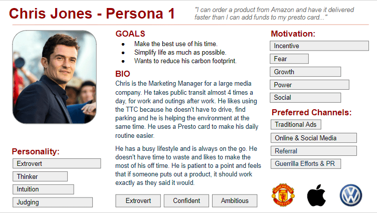
Chris — The Focused Professional
• Works downtown
• Relies on GO Train daily
• Values reliability and efficiency
• Wants reminders so he never misses his train
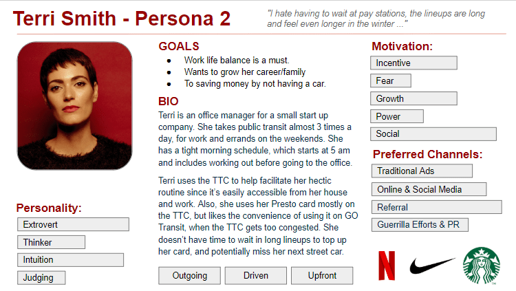
Terri — The Busy Multitasker
• Commutes across multiple transit lines
• Often distracted by work messages and family responsibilities
• Wants quick payment and simple alerts
Both personas highlighted the importance of automation and minimal interaction.
Information Architecture
Using research insights, I created a simplified feature structure focused on the core commuting tasks.
Primary Features
• Account creation
• Transit card connection
• Balance and fare tracking
• Auto top-up
• Commute schedule setup
• Smart leave reminders
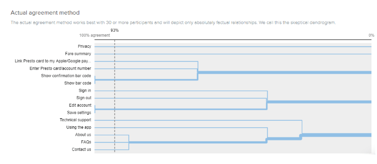
To validate navigation structure, I conducted a card sorting exercise using Optimal Workshop, helping define how users expected transit features to be organized.
CARD SORTING VIA OPTIMALWORKSHOP.COM
IA - CREATE AN ACCOUNT
IA - LINK YOUR PRESTO CARD
IA - TOP UP PRESTO CARD
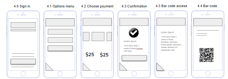
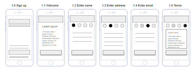
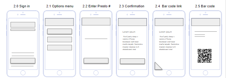
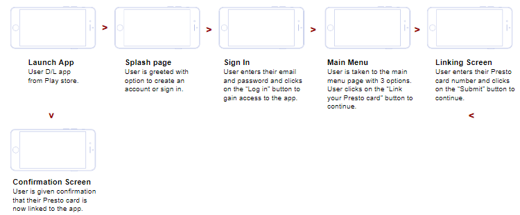
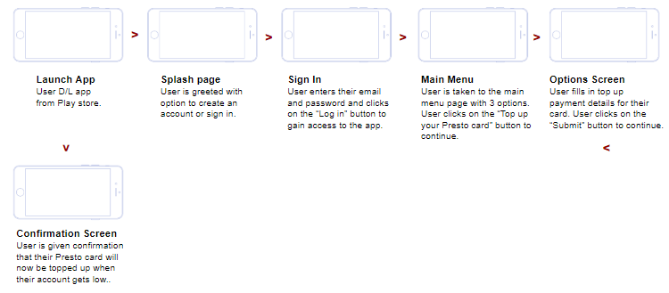
USER FLOW
LINKING USER’S TRANSIT ACCOUNT TO THE APP
TOPPING UP THE APP
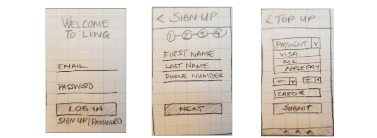
SKETCHES
I started brainstorming logos and look and feel. Coming up with brand adjectives helped me narrow my vision. I sketched different ideas first, and then created digital versions of my favorites.
CONCEPT SKETCHES TO DEVELOP FUNCTIONALITY AND LAYOUT.
Design System
The buttons, fonts and colours were added to the Style Guide, a constantly changing document that contained the app components and UI patterns.
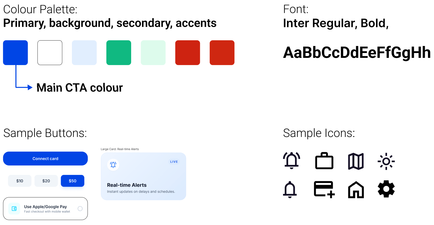
Visual Design
The interface was designed to support quick, glanceable information.
Design principles:
• Large readable numbers
• Minimal navigation layers
• Clear status indicators
The visual language draws inspiration from modern fintech apps and digital wallets, emphasizing clarity and trust.
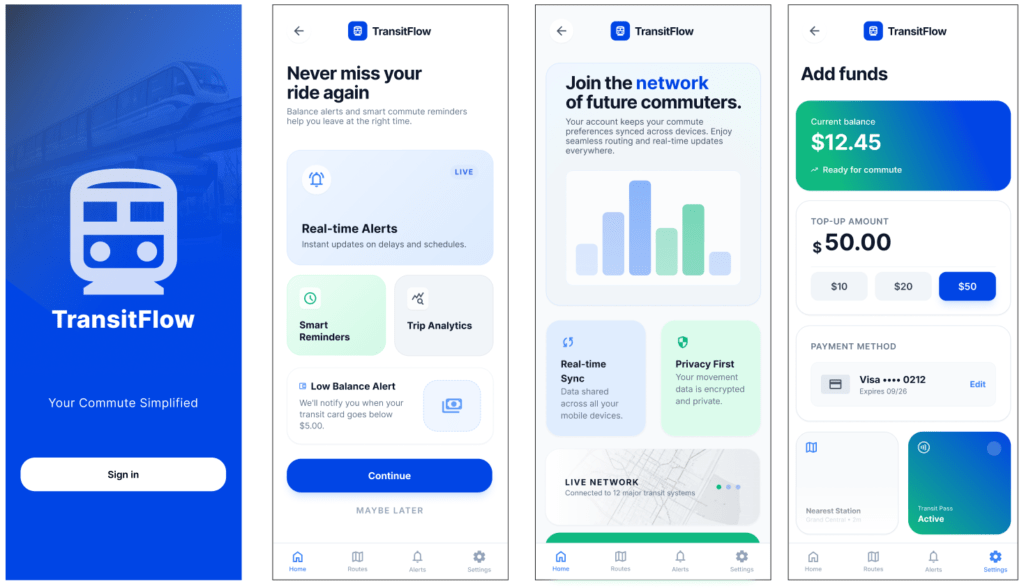
FINAL Mock ups
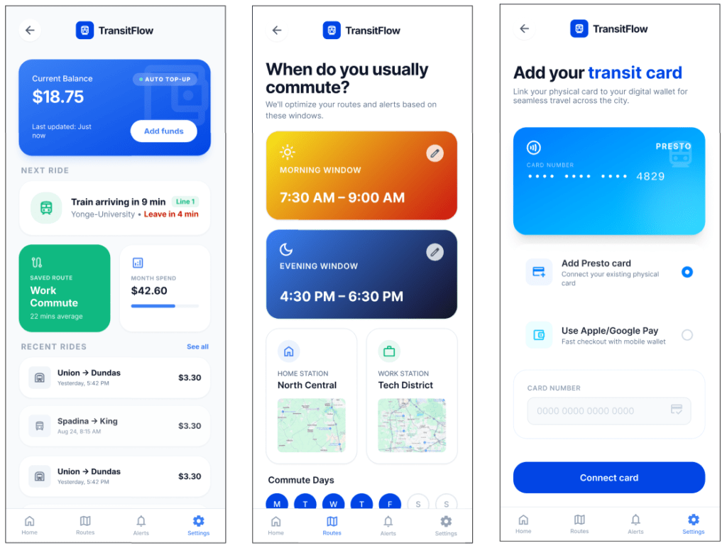
Daily Use (Watch + Phone)
The system then assists users passively.
Examples:
Balance monitoring
Users can quickly check their balance before boarding.
Smart leave alerts
Example notification:
“Leave in 4 minutes to catch your 8:00 AM train.”
Tap ride confirmation
After boarding, the app confirms the fare deduction and updated balance.
Final Outcome
TransitFlow transforms the transit experience from a reactive tool into a proactive assistant.
Instead of asking commuters to constantly check schedules and balances, the system quietly manages timing and payments in the background.
Key benefits include:
• Reduced missed rides
• Faster fare payments
• Lower commuter stress
• Better awareness of upcoming transit
What I Learned
Commuting is a behavioral problem as much as a transportation problem.
People rarely miss transit because they lack route information. They miss transit because mornings are chaotic and time perception is unreliable.
Designing for these behavioral realities led to a more meaningful product.
Additional lessons included:
• Early wireframing prevents costly design revisions
• User interviews reveal deeper behavioral insights than feature brainstorming
• Passive assistance is often more valuable than complex functionality
• Progressive disclosure and predictive alerts reduce cognitive load
• Cross-device design (phone + watch) enables minimal friction
• Designing for real-world context elevates the value of UX beyond screens
How I Added Value
• Reframed the product from a payment utility into a commute assistant
• Simplified navigation to reduce cognitive load during busy routines
• Introduced predictive leave reminders to reduce missed rides
• Designed a phone + watch ecosystem for seamless commuter interactions
Future Opportunities
• Social location sharing: Users could optionally share commute status with colleagues, friends, or family—for example, to coordinate meeting someone at the station or to let someone know when they’re arriving at work or home.
• Integration with additional transit systems and multi-modal trips
• Enhanced predictive analytics for commute optimization
• Personalized recommendations for routine adjustments based on traffic, transit delays, or personal habits